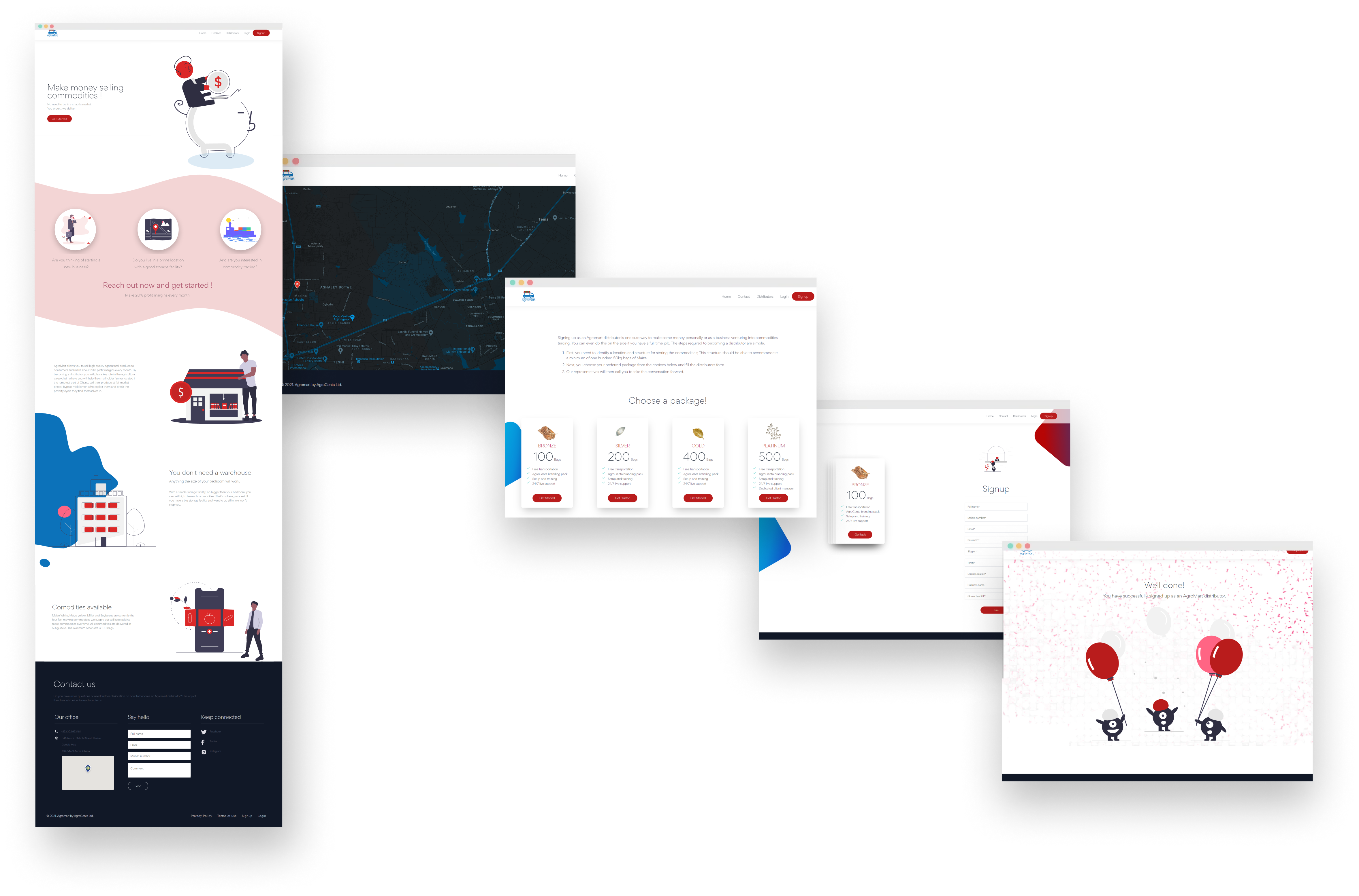
Agromart’s core aim is to onboard crop and agricultural product distributors or retailers with their atrractive and lucrative trading packages. This retailing process brings high returns and can be done by anyone. However most retailers who tried to sign on begun to find inconsistencies between the existing website info and the process on the ground. Our goal was to create a new product website that was updated and consistent with the real world signing process and improve the look and feel to increase its signing capabilities.


Early wireframe sketches (Left), Brainstorm and initial IA draft (Right)
As the sole UI/UX designer, I led the end-to end research and design process - conducting research, brainstorms, designing the information Architecture and crafting all marketing features of the product website. Doubling as a front-end designer as well, I rolled up my sleeve and coded coded the user interface of the website.
I looked over a variety of websites for inspiration and identified the pros and cons of each website. I brainstormed on how I could incorporate the good attributes (good call to action, simple and concise content, etc) into our website. After all the competitive analysis and internet research I came up with our own mood board for the site.
I created various mocks for responsive design in sketch as well as Figma and discussed with the co-founders. After many updates, discussions and iterations we arrived at our final product. I immediately begun developing the project.
After launching v.1 I continued to research and iterate on new features using constructive user feedback from the v.1 testing to create a better user suited model.
I had no experience with the existing website. Therefore, I started with identifying key problems in the current website with fresh eyes and carried out a UX audit to understand the pain points and areas of improvement needed, through the live experience of the site. As I figured out the pain points the next step in the process was to decide the mood and expectations for the website.
I followed an agile project management framework for this task which helped me in iterating and testing the ideas faster. While doing this I had rounds of discussions with the co-founders, who provided me the design brief, and came up with an Information Architecture.
After development, the first iteration was tested with users who had both interacted and not interacted with the previous model for qualitative feedback to inform the development of version 2(v.2).


High fidelity wireframe draft (Left), Information Architecture Diagram (Right)
To better serve all agricultural product distributors, I created the new Agromart website to present the lucrative opportunities within which they could retail. In addition to an inviting landing page we included new features like a sign-up page that showed distributors how to join the distribution chain, a distribution page showcasing the existing distributors and a case study page showing how AgroCenta through Agromart was impacting the lives of many smallholders in the rural areas of Ghana.

This product was designed and shipped within two months. Since launch, users have experienced zero inconsistencies with the on-boarding process. The marketing and sign up teams have seen an increase in interested distributors and due to very positive responses from users, iteration and expansion is a top company priority for the future.