Cropchain is a user-friendly integrated agricultural supply chain management platform that enables a user to manage everything in the agric supply chain including outgrower schemes, logistics, traceability, digital trading, quality assurance and data analytics.
The brief presented to me was to redesign Cropchain, the parent app, enhancing the look and feel of all underlying features connected to its sub apps.
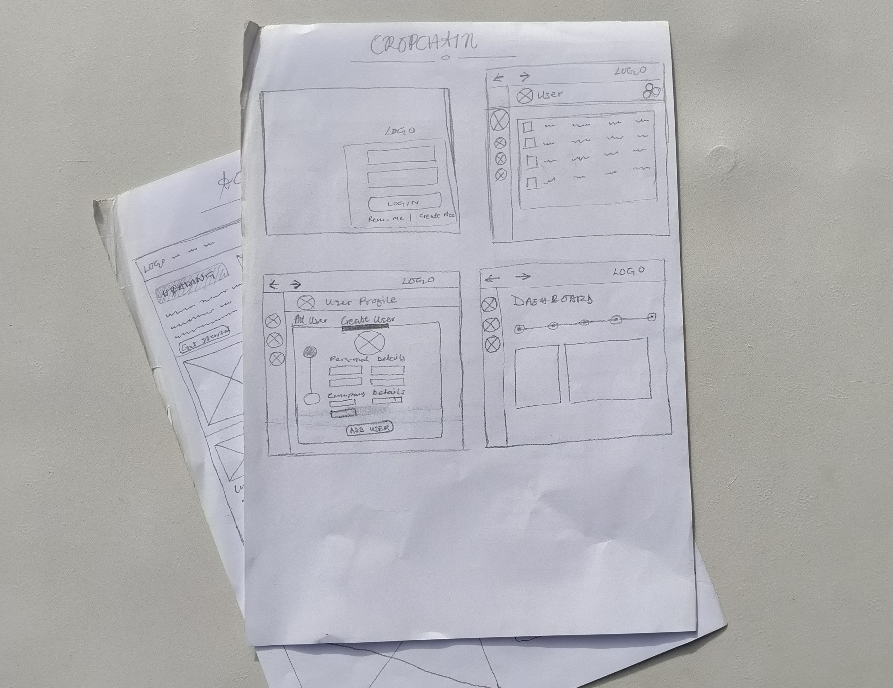
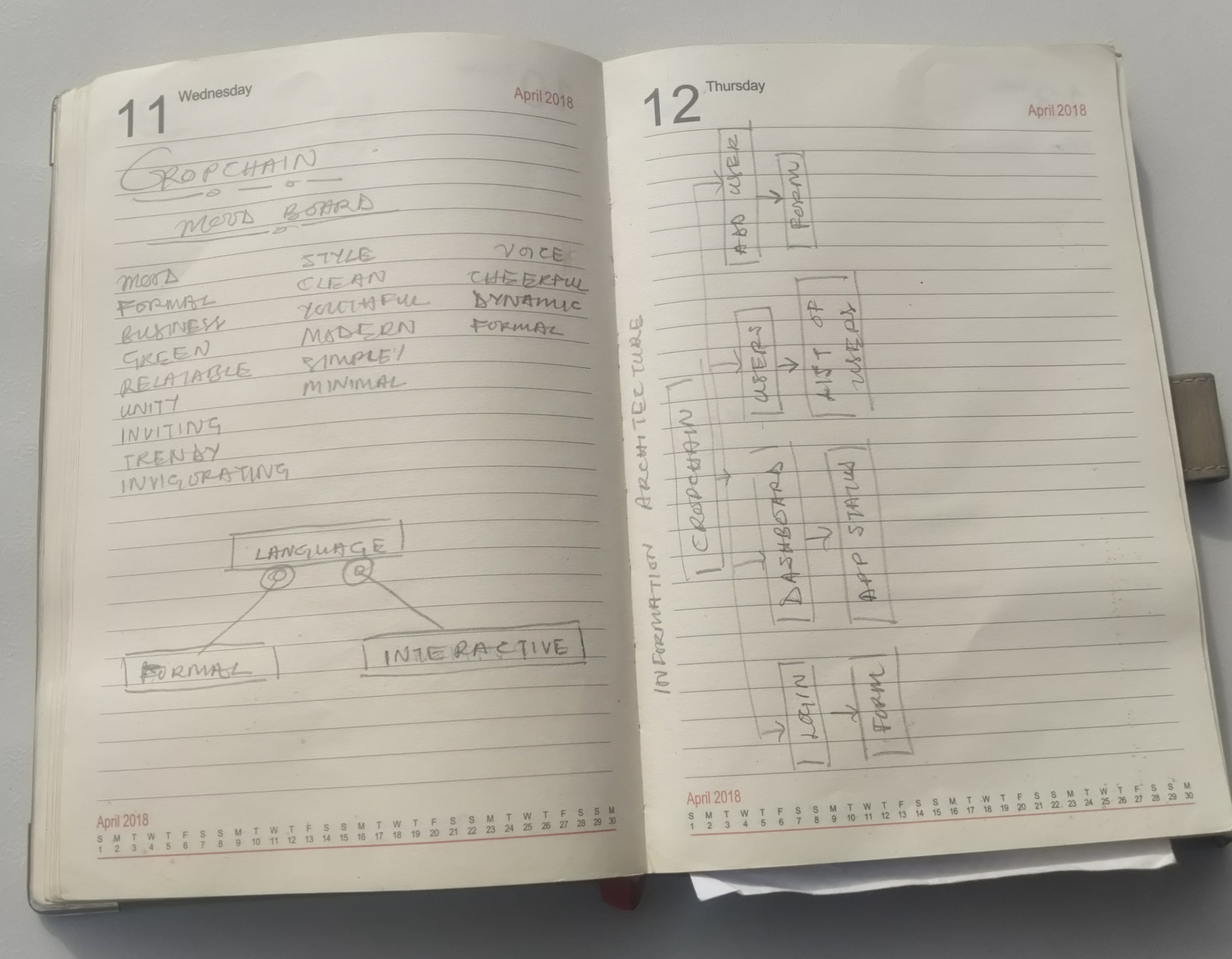
Early wireframe sketches (Left), Brainstorm and initial IA draft (Right)
As the sole UI/UX designer, I led the end-to end research and design process - conducting research, leading brainstorms, designing the information Architecture of the app and creating the final UI design.
I looked over a variety of similar apps for inspiration and identified the pros and cons of each of them. I brainstormed on how I could incorporate the good attributes I found (good call to action, simple and concise content, etc. ) into our app and came up with our own mood board.
I created various mocks for responsive design in sketch as well as in Figma and discussed with the co-founders. After many update discussions and iterations we arrived at our final design.
The Cropchain app continues to be further developed into various new iterations. Although my role as a part of this project ended with the design of the app, its development has since seen many improvements and it continues to be transformed with the changing vision of the company for it.
I started with identifying key problems in the current app. I then investigated similar products to identify pain points and where Cropchain can be unique. As I figured out the pain points the next step in the process was to decide the mood and expectations for the app.
I followed an agile project management framework for this task which helped me in iterating and testing the ideas faster. While doing this I had rounds of discussions with the co-founders and our engineering team who helped me to sort out my thoughts and come up with the Information Architecture.
The next step for me was putting together the visual details of the app. I had to put together everything including the text hierarchy, graphics, images etc. , to add up to the overall look & feel of the app and enhance the delivery of the platform’s purpose precisely.
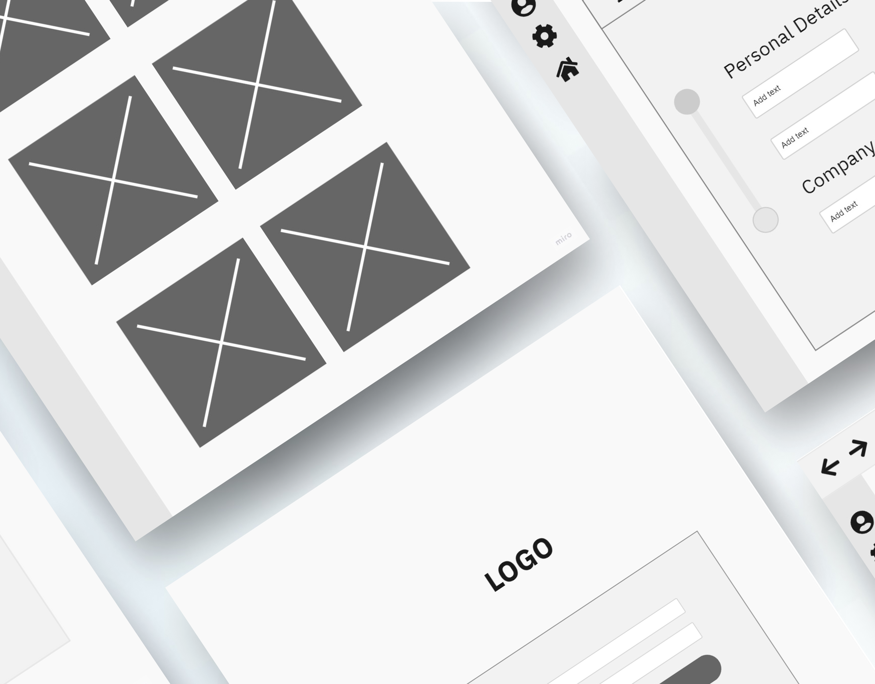
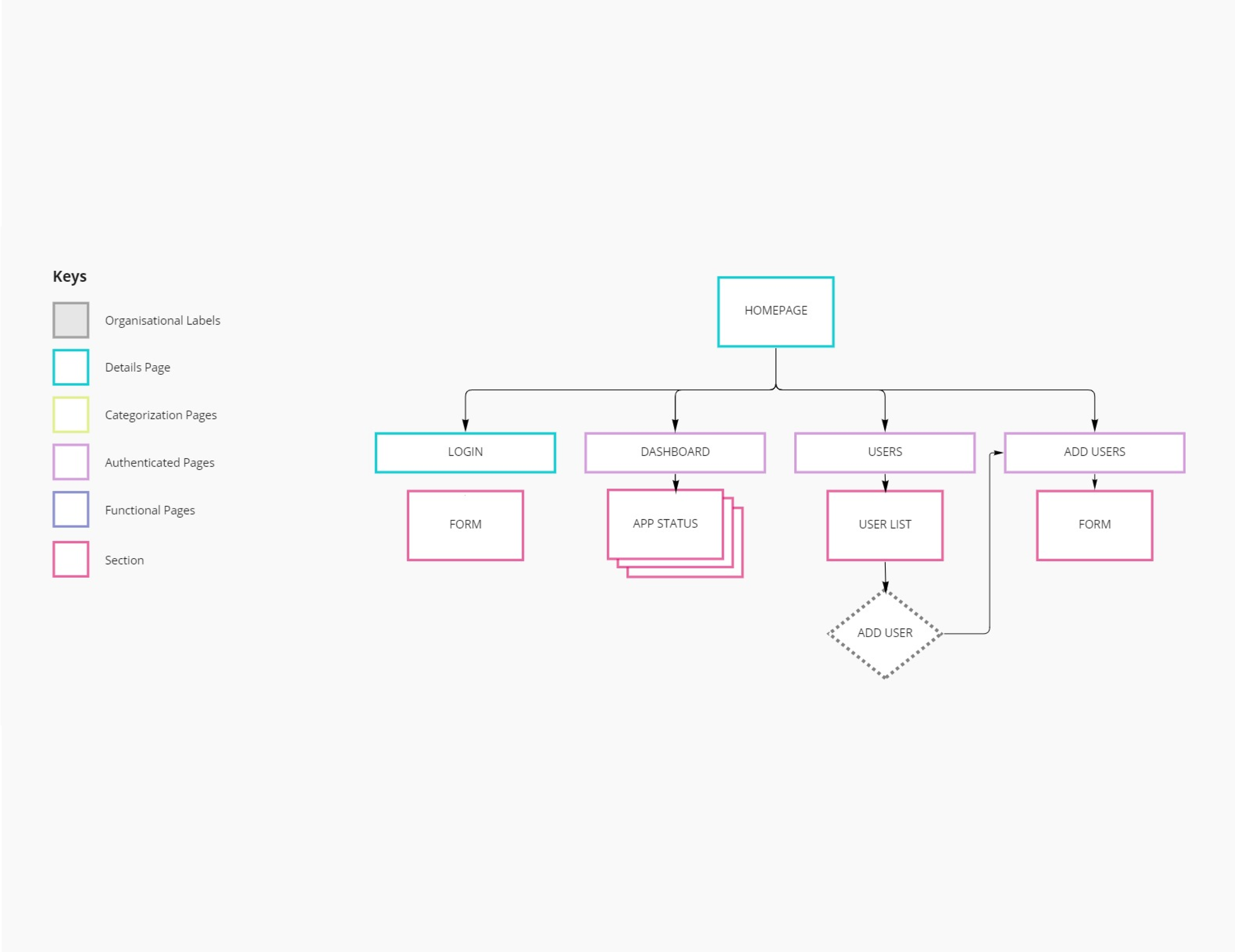
High fidelity wireframe draft (Left), Information Architecture Diagram (Right)
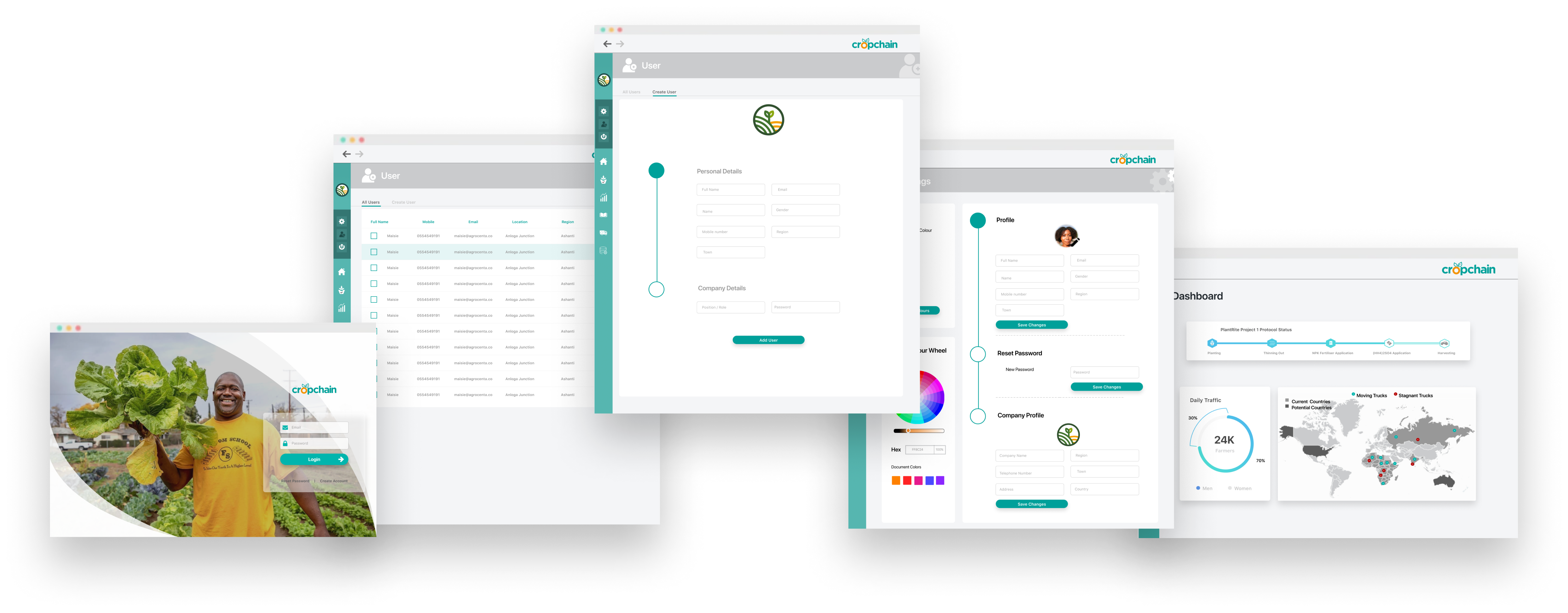
The new Cropchain redesign included a template of reference for the software engineering team to use in development for the final product. Within this was included a design template for the application’s dashboard, users page, user profiling page, settings and login. It also detailed the design for integration of all the sub apps within Cropchain.
Although Cropchain has not been launched yet, being a part of this project was a great opportunity for me. It served as a major learning platform to hone many UI/UX design skills including; research, ideation, prototyping, testing and people skills like communication. I learnt to work as a part of a Tech team and to pitch my ideas to project stakeholders. I was also given the opportunity to work on a great project that would undoubtedly leave an indelible mark in African Agribusiness.